
A designer approves a green. Six weeks later the tiles arrive and the green is not quite the green on the sample. Or the first phase of a hotel is tiled, the second phase is ordered eight months later, and the two walls do not read as the same colour when you stand between them.
Both situations are avoidable, and both are almost always caused by the same thing: treating a handmade glaze as though it were a paint reference. It is not. Understanding what a zellige colour reference actually promises – and what it does not – is the whole of this guide.
Three different things called variation
They get conflated constantly, and they have completely different implications.
1. Variation within a single tile
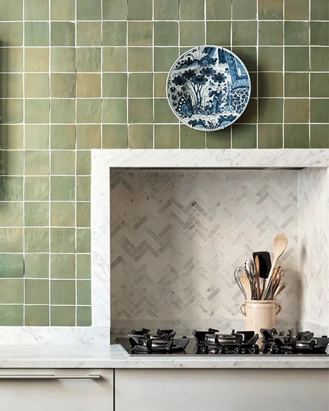
Glaze applied by hand does not sit at a constant thickness, so a single tile is darker where the glaze pooled and lighter where it thinned. This is the quality people specify zellige for. It needs no management at all.
2. Variation between tiles in one production run
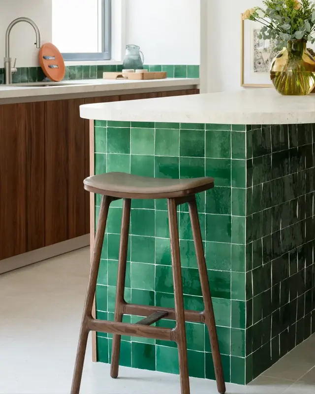
Tiles fired together still differ, because a traditional kiln is not uniform and where a tile sat affects how it came out. This is the variation that has to be distributed – and distributing it is an installation task, not a supply one.
3. Variation between production runs
The one that causes projects trouble. Two runs of the same glaze reference, fired months apart, will be closely related but not identical. This is the variation that has to be designed out of the programme by ordering differently, because no amount of care on site can fix it afterwards.
What a colour reference actually promises
A reference number on a zellige chart identifies a glaze recipe and a resulting family of tones. It is a commitment to a colour, in the way a fabric mill commits to a shade – not a commitment that any two tiles will be indistinguishable.
The reason sits in how the material is made: the clay body is unrefined, the glaze is applied by hand, and the colour is finally decided by the kiln rather than by the mix. A glaze goes into the kiln one colour and comes out another. That transformation is repeatable in character, not in exact value.
Which means the useful question at specification stage is not “can you guarantee this colour” but “what are we agreeing this colour against, and how much of it are we producing at once”.
Five things that control it
- Approve against fired tiles, not a printed chart. A photograph of a glaze is a photograph. Approval should happen against actual tiles, seen in the project’s own light, and ideally as a panel rather than a single piece.
- Keep a reference sample, labelled. Whatever is approved, keep physical tiles from it, label them with the reference and the project, and store them somewhere that is not a site hut. They are the benchmark for everything that follows.
- Order the whole area in one production run. This is the single most effective control available. Every square metre that will be seen together should be made together – including spares.
- Blend on site, from several boxes at once. The installer should be drawing from four or five open boxes simultaneously and mixing as they go. Laying box by box is what produces visible banding across a wall, and it is the most common avoidable failure with this material.
- Hold attic stock from the original order. Because colour is matched within a run rather than across time, the only reliable future repair is material from the same run. Keep it, label it, and hand it to the operator at completion.
On quantities
Handmade tile needs a more generous allowance than a machine tile – for cuts, for blending, for breakage in transit and for the attic stock above. The right figure depends on the layout, the number of cuts it generates and the complexity of the setting out, so agree it with your supplier against the actual drawings rather than applying a rule of thumb. What matters far more than the percentage is that it is ordered with the original run, not afterwards.
Writing it into the specification
Four clauses cover most of it, and they save a great deal of argument later:
- Variation is expected and accepted. State plainly that tonal variation between tiles is inherent to the material and is not grounds for rejection. Without this, a diligent clerk of works has no basis on which to accept a delivery.
- Approval is against a retained reference sample. Name where it is held and who holds it.
- Blending is a contractor obligation. Require mixing from multiple boxes across the whole installation, written into the tiling package rather than assumed.
- A sample panel precedes the main installation. Built on site, in the actual location where possible, approved before the rest proceeds. It also settles grout and joint decisions – see choosing grout colour for zellige.
When variation is working for you
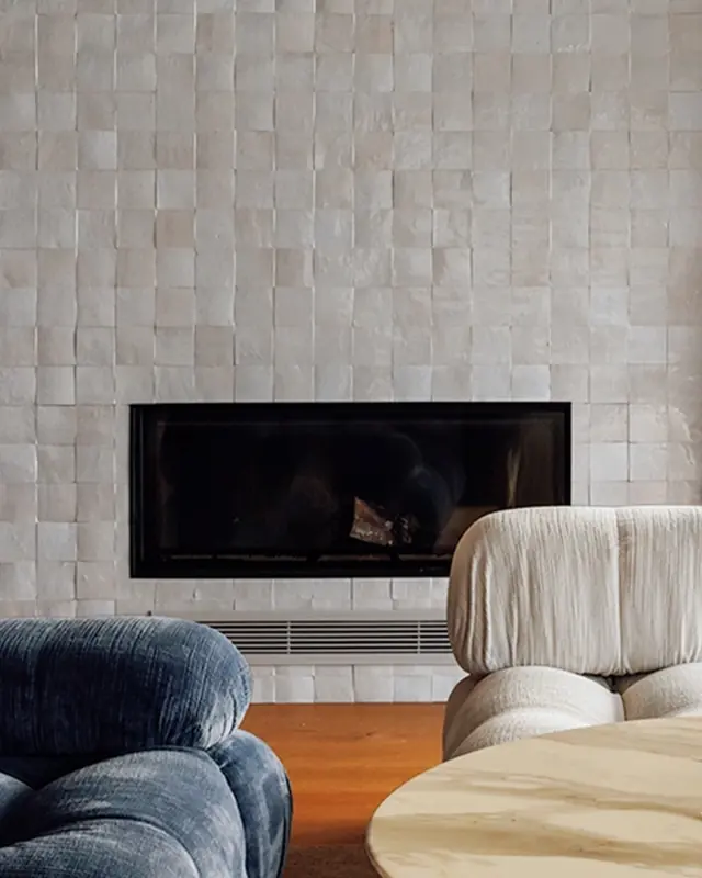
It is worth remembering why anyone accepts all of this. On a large wall, tonal range is what stops a flat surface reading as flat. The colour moves with the light through the day, the wall has depth at ten metres and detail at half a metre, and no repeat ever becomes visible because there is no repeat to find.
Specifiers who fight the variation get a worse wall than the ones who plan for it. The whole discipline here – approve properly, order once, blend well, keep spares – exists so that the variation lands as richness rather than as inconsistency.
Our colour range is photographed as fired for exactly this reason, and custom colours are developed against a physical reference at sampling stage rather than matched from a screen.