
Every zellige wall is really two materials: the glazed tile and the line between the tiles. On a machine tile the second material is a technicality. On zellige, where the tiles vary in size and the joints vary with them, it is half the design.
Choose it badly and one of two things happens. Either the joint disappears entirely and the wall loses the hand-cut geometry that made it interesting, or the joint becomes a drawn grid and every small irregularity in the tile is outlined in a contrasting colour. Both are avoidable, and the decision is easier if you think in terms of three strategies rather than a colour chart.
Strategy one: let the joint vanish
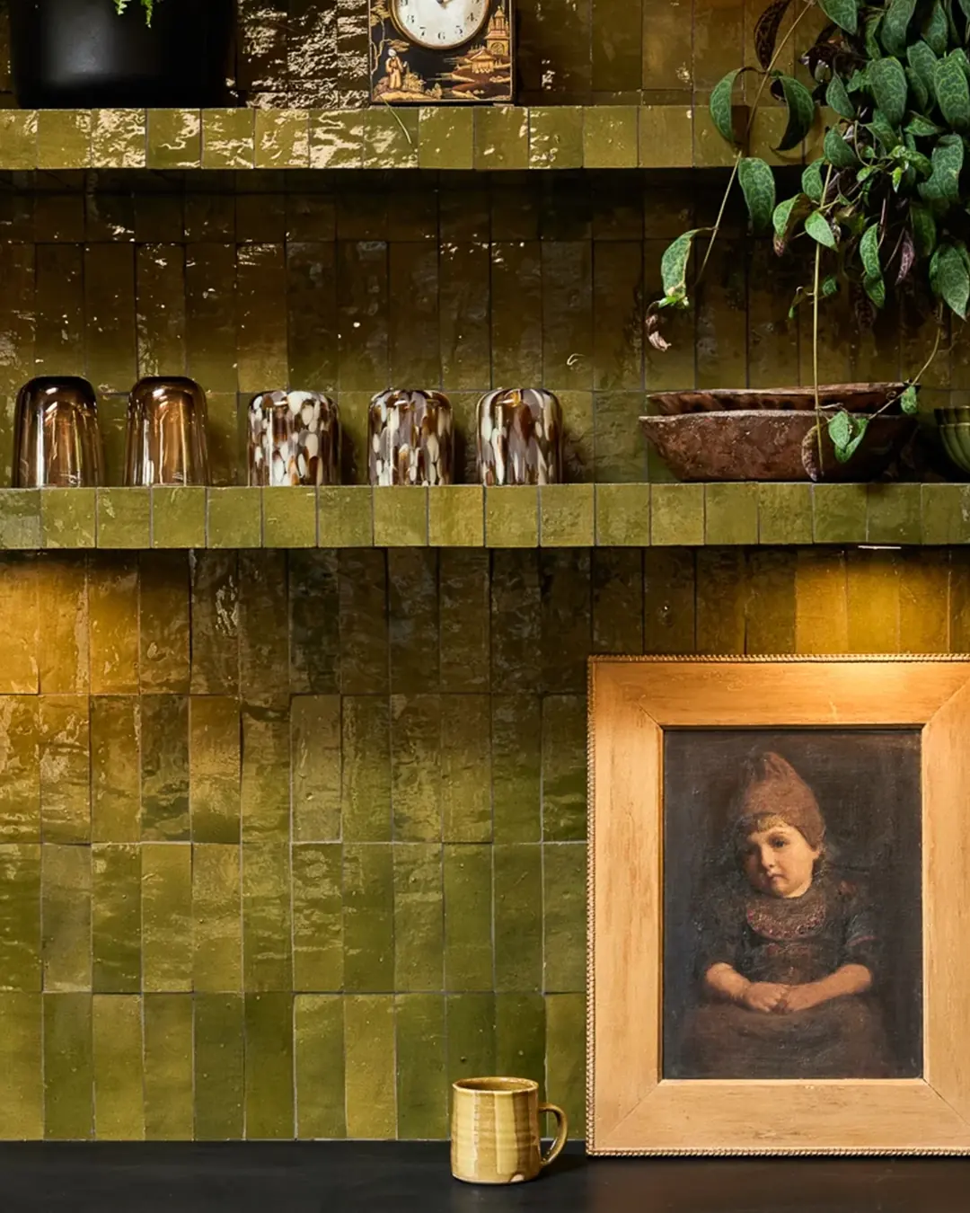
Match the grout as closely as possible to the tile, and the wall becomes a single field of colour. The variation between tiles still reads – the glaze still catches light unevenly – but the geometry recedes. This is the approach that makes a zellige wall look like a wall rather than like tiling.
It suits saturated colours best. A deep teal, olive or bronze glaze on a wall with a grout in the same family reads as a mass of colour with light moving across it, which is usually why the colour was chosen in the first place.
The cost is forgiveness. With a matched joint, small deviations in joint width become invisible, which is an advantage. But the wall also loses the crispness that makes a small panel read as craftsmanship rather than as an approximation.
Strategy two: a tone beneath the tile
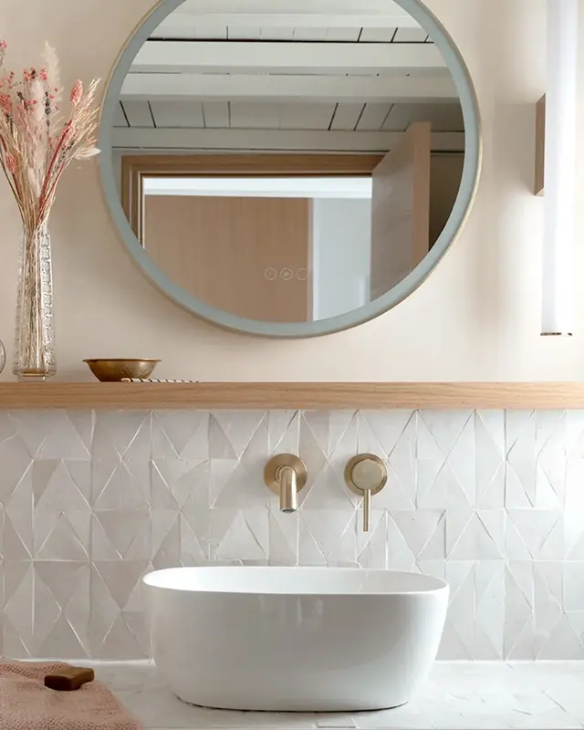
The middle path, and the one we would suggest by default. Instead of matching the tile, take the joint a step darker – or in the case of a dark tile, a step lighter – so that it reads as shadow rather than as line.
This gives you the hand-cut geometry without a drawn grid. The eye interprets the joint as depth between tiles, which is close to how the surface behaves in reality, and it is far more forgiving of variation than a true contrast because there is no crisp edge for the eye to measure against.
It is also the most practical choice for a wet area, a splashback or anywhere the wall is going to be cleaned regularly, since a joint a shade darker than the tile ages more gracefully than a joint chosen to be conspicuously pale.
Strategy three: draw the grid deliberately
A genuinely contrasting grout – dark joints on a pale tile, or the reverse – turns the wall into a graphic. Every tile is outlined, the geometry becomes the subject, and the hand-cut irregularity is put on display rather than softened.
When it works, it is very strong: a bar front, a reception panel, a small feature wall where you want the surface to read as pattern from across a room. When it fails, it fails visibly, because contrast is unforgiving. Any variation in joint width, any tile sitting slightly proud, any inconsistency in the setting out is now outlined in a different colour.
Two conditions before choosing it. First, the installer needs to be experienced with handmade tile and confident about maintaining a consistent joint. Second, the area should be contained – contrast that reads as deliberate on a two-metre panel can read as busy across a whole room.
The test that settles the argument
Have a sample panel made with the actual tile and two or three candidate grout colours, side by side, then look at it in the room’s real light – and from the distance people will actually stand at. Grout decisions made on a desk, at 40 cm, under an office downlight, are the ones that get regretted. Photograph the panel too: clients approve photographs, so it is worth knowing how it renders.
Things that change the answer
- The size of the area. Contrast intensifies with scale. What reads as crisp on a splashback can read as restless across a full-height hotel wall.
- Viewing distance. A bar front is seen at a metre; a lobby feature wall at ten. At ten metres a matched joint may disappear so completely that the surface loses its texture, so it can be worth going slightly darker on large, distant walls.
- Light. Grazing light from a wall washer exaggerates joints and surface relief. Flat frontal light flattens them. If the lighting design is known, judge the sample under it.
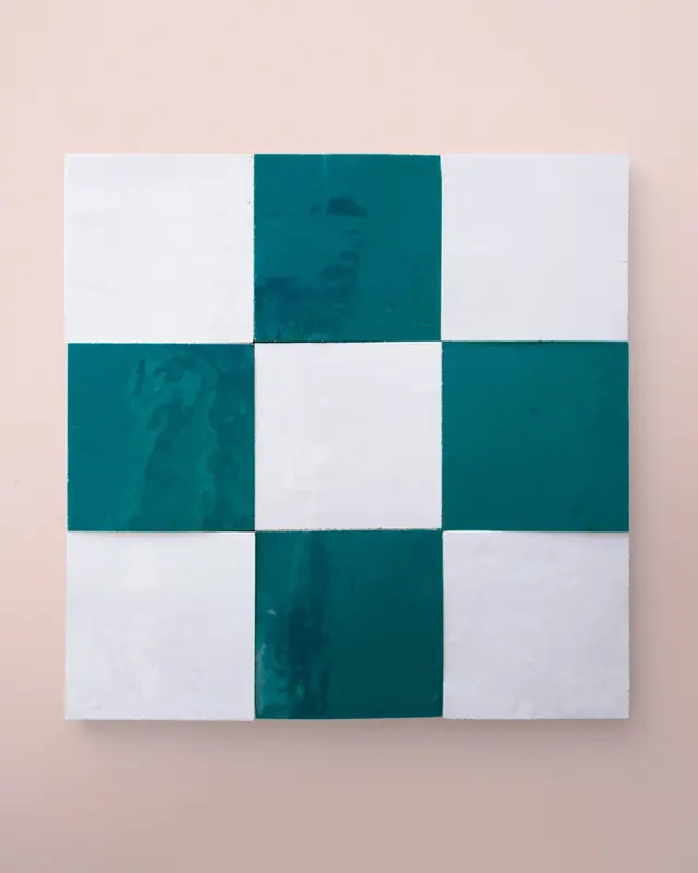
- The layout. If the tile is doing something structural – a check, a border, vertical bands, a cut pattern – keep the grout quiet. Two patterns on one wall compete.
- How it will be cleaned. Anywhere subject to a daily commercial cleaning regime, a mid-tone joint hides the ordinary life of the building better than either extreme.
Joint width, briefly
Joint width is a related decision and is usually taken with the installer rather than in the specification, because it depends on the particular tiles in the particular delivery. As a rule, a tighter joint pushes the wall toward reading as a single surface and a more generous joint pushes it toward reading as a composition of individual tiles – the same axis the colour decision runs along.
Whichever you choose, agree it before the first panel goes up and confirm it on a dry lay. It is a decision that is nearly impossible to change once a wall is grouted, and it is far cheaper to spend an hour on a sample panel than a week arguing about a finished one.