
Three things separate choosing a zellige colour from choosing any other finish colour, and all three matter in hospitality.
It moves. A hand-glazed surface reflects light at many angles, so the colour you see depends on where you stand and where the light is coming from. A wall that reads as deep teal from the entrance can read as almost black from the banquette opposite.
It is a range, not a value. Every glaze reference covers a family of related tones rather than a single one – the subject of why zellige colour varies between batches. The palette has to be built from ranges.
Gloss changes everything. The same colour in a dim spa corridor and a daylit restaurant is doing two different jobs, because in the first it is a light source and in the second it is a surface.
So the useful question is not which colour, but which colour in which light, seen from where.
Four palette families that work in hospitality
These are starting points rather than prescriptions – combinations we see hold up across hotel, restaurant and spa schemes. Select any swatch to see its name, reference and a direct enquiry.
Sand, plaster and bone
The quietest palette and the most forgiving. Used across a large area it produces a surface with texture but no colour statement, which lets a floor, a rug or a light fitting carry the room. It also handles daylight better than anything else here – where a strong glaze can go flat or glare, these hold their warmth.
Best in: lobbies, all-day dining, corridors, anywhere the tile is the background.
Deep green
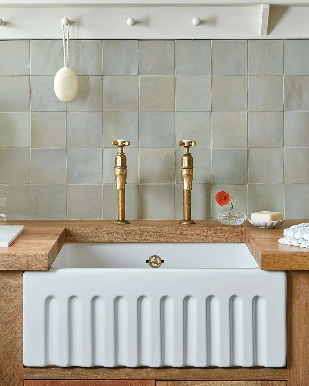
The strongest single-colour move available in this material, and the one that photographs best. Green glazes carry an unusually wide tonal range, so a green wall has more visible depth than almost any other colour – it looks like a material rather than a finish.
Best in: bar fronts, restaurant walls, spa treatment rooms, guest bathrooms. Pale sages behave quite differently from bottle greens, so decide early which end you are at.
Blue and teal
The most obviously Moroccan palette and the easiest to overplay. Deep teals and indigos are superb in wet areas, where steam and reflected light give them somewhere to go – see zellige in showers and hammams. In dry public rooms they can read as cold unless something warm is set against them.
Best in: spas, pools, guest bathrooms, feature panels. Pair with brass, terracotta or unbleached wool rather than with grey.
Terracotta and rose
Warm, earthy and distinctly Moroccan without being obvious about it. This family does something the others cannot: it flatters people. In a restaurant or a bar, warm clay tones reflect onto faces at close range, which is a genuine and underused reason to choose them.
Best in: dining rooms, bars, bedrooms, anywhere guests are seen close to the wall.
Building the palette
Four rules cover most schemes.
- One colour carries the project; the rest support it. Decide which glaze is the scheme’s colour and use it in the places that matter. Everything else should be a neutral or a close relative of it.
- Vary tone within a family rather than adding families. Three greens will always read better together than a green, a blue and a pink. The variation inside a single glaze is already doing a great deal of work.
- Keep a strong second colour small. A border, a frame, a niche lining, a band of risers. Used as an accent, a strong colour is a decision; used across a second wall, it becomes a competition.
- Test against the real lighting. Not the office. Take the samples into the space if it exists, or under the specified lamp if it does not. A glaze under a cool downlight is a different colour from the same glaze under a warm one.
Darks and metallics
Black, charcoal, bronze and antique gold glazes are worth knowing about even if they never carry a whole room. A dark glaze used as a base band, a border or a single column does what a deep skirting does in a painted room – it grounds everything above it. Custom colours can also be developed against a physical reference at sampling stage, so a palette is never limited to what is on a chart.
Coordinating with everything else
A zellige palette does not exist alone. Three relationships decide whether it works in a finished hotel:
- With the floor. A glaze chosen against a bejmat floor rather than in isolation is what makes the two read as one family – the argument in zellige or bejmat.
- With the metal. Green and terracotta glazes sit naturally with warm brass; blues can fight it. If both are in the scheme, judge them together and read brass finishes for Moroccan lighting before fixing either.
- With the grout. The joint is half the wall, and the grout decision can shift the apparent colour of the whole surface. Settle it on a panel, as set out in choosing grout colour.
The full range – 86 standard glazes, photographed as fired – sits on the zellige page, filterable by colour family.